WINTERSANDS: DESIGN
This week, we travel into the past – without artefacts! – to the part of the game that’s all done and ready: its design. It is a tale of non-designers growing wiser as they make designer decisions. So, once upon a time…
THE LEGEND OF LOGOS
… we came up with the studio name – or wha’ever, right? Or, the other way round. WHA’EVER STUDIOS is a happy product of an epiphany about how we want to work on the game: our wha’ever means both chill (because we don’t want to stress ourselves out making WS) and anything (because anything can happen and there’s no hard plan). Hmm, but which one should we put onto the logo?
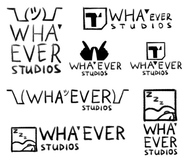
We started with wha’ever as in chill
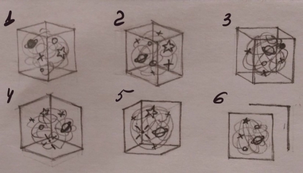
When… this happened?
Eventually, we went with wha’ever as in anything, because working with anything at all without limiting oneself translates to being creative, open and free. The cube on our logo contains the entirety of the Universe, but it is also open to anything from without!
Creating this logo is also how we met Ami, our artist
 |
Why a cube? Well, because it is our very own Pandora’s box! Not as in ‘it contains all evils’ (we’ll see how the game goes, though), but because in the myth, it was opened out of curiosity and a desire to learn something new, and that’s how we roll, too. |
The WINTERSANDS logo was quite another beast. It had to reflect what the game would be, that is, a fantasy story that’s hip and stylish, sort of like magical realism in another reality. And the amazing person who braved this quest was a designer from Singapore, Vanessa. Having forged the WS logo, Vanessa vanished into her bright designer future, and though we know little of her, songs will be sung about her feat for ages to come.
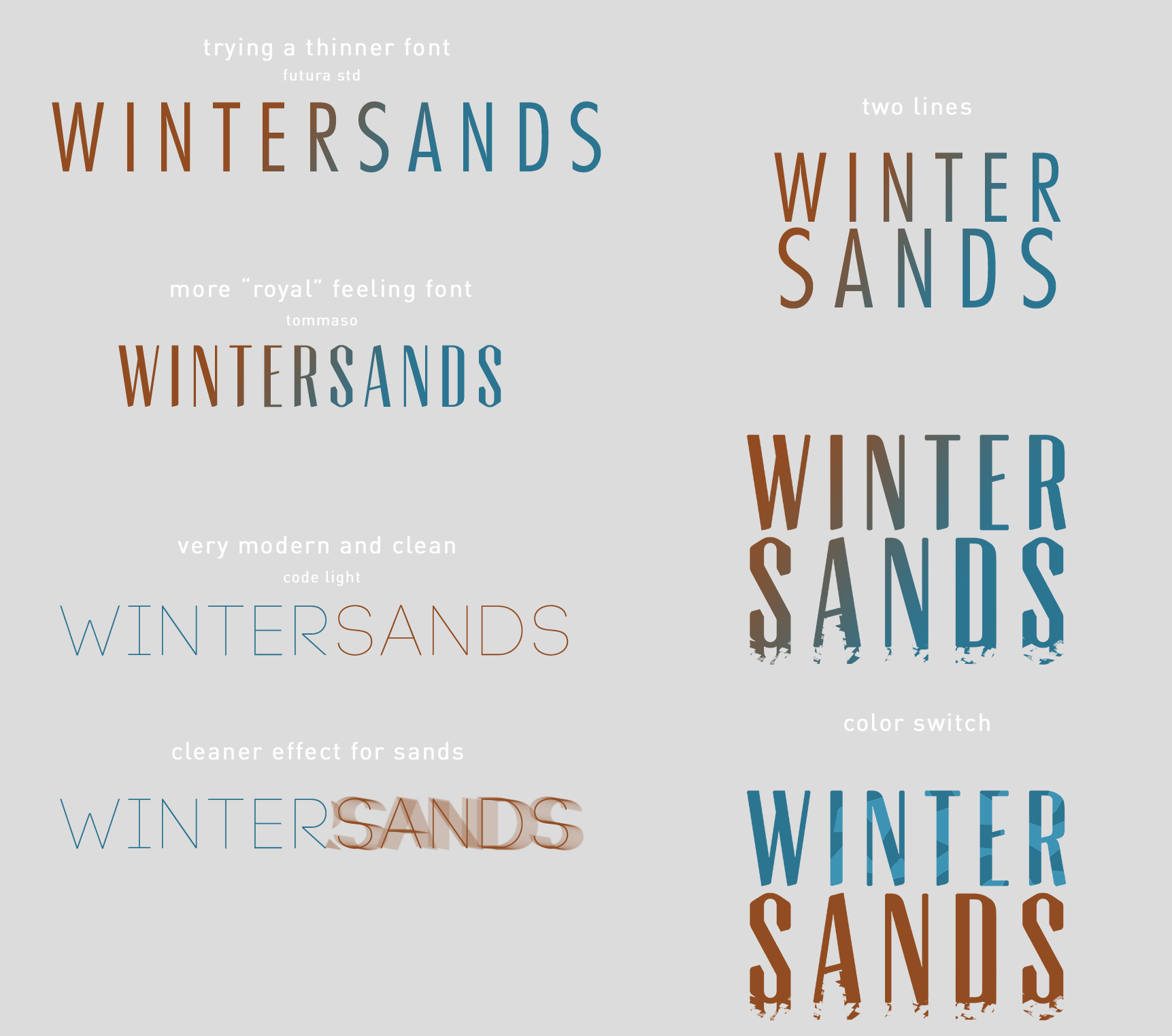
We will save you from our own attempts at the logo, pre-dating Vanessa’s takes that you see above
THE TALE OF TYPOGRAPHY
Fonts are important when you want to make a visual novel in style. Tommaso is the name of the font we chose for the game’s logo, and we decided to use it in larger headings, too, including in the main menu. And so we sealed our fates!
It turned out that Tommaso does not exist in Cyrillic (that we needed for the Russian version). Also, that you have to wield the art of typography to draw it, as fonts are created in special software and formats, and your letters need to be evenly sized and spaced. We did it eventually, feeling like Victor Frankenstein every bit of the way, as we cut up and smashed together Latin letters into Cyrillic ones.
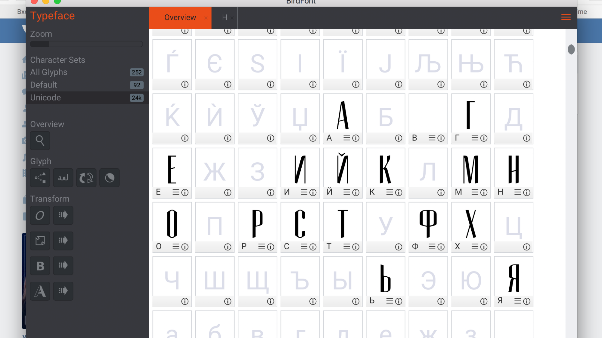
It’s alive! Ф (F) is for Frankenstein, and we built it out of two Ps!
By the way, we did buy a licence for the English font. And for the second font that we use in dialogues – TT Drugs. Needless to say, that is when we felt like proper adults!

Goodbye, childhood, we’re serious peeps now :’^)
THE FABLE OF THE FIVE ELEMENTS
Visual novels, dating sims and RPG games are like LEGO in terms of interface. There are separate building blocks that must work well together to create a single, organic and stylish look. Here they are:
- menu panels (don’t forget about smart spacing!)
- buttons (make them fun but obvious to the player!)
- dialogue box (banish any confusion as to who’s talking to whom!)
- the protagonist’s icon (make up your mind – will it blink, or is that creepy?)
- dialogue option / action menu (make sure it doesn’t block out anything important or pretty!)
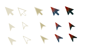
And pointers.
There’s also the desktop icon and the larger buttons for the mobile app. Each is a long story, because, well, we’re not designers and we had no overall vision (barring the palette suggested by the WS logo), so we didn’t know where to start.
 |
Wait for Chapter One to find out why the chose the stark and stunning contrast of rich maroon and midnight blue for the logo, menus and buttons! |
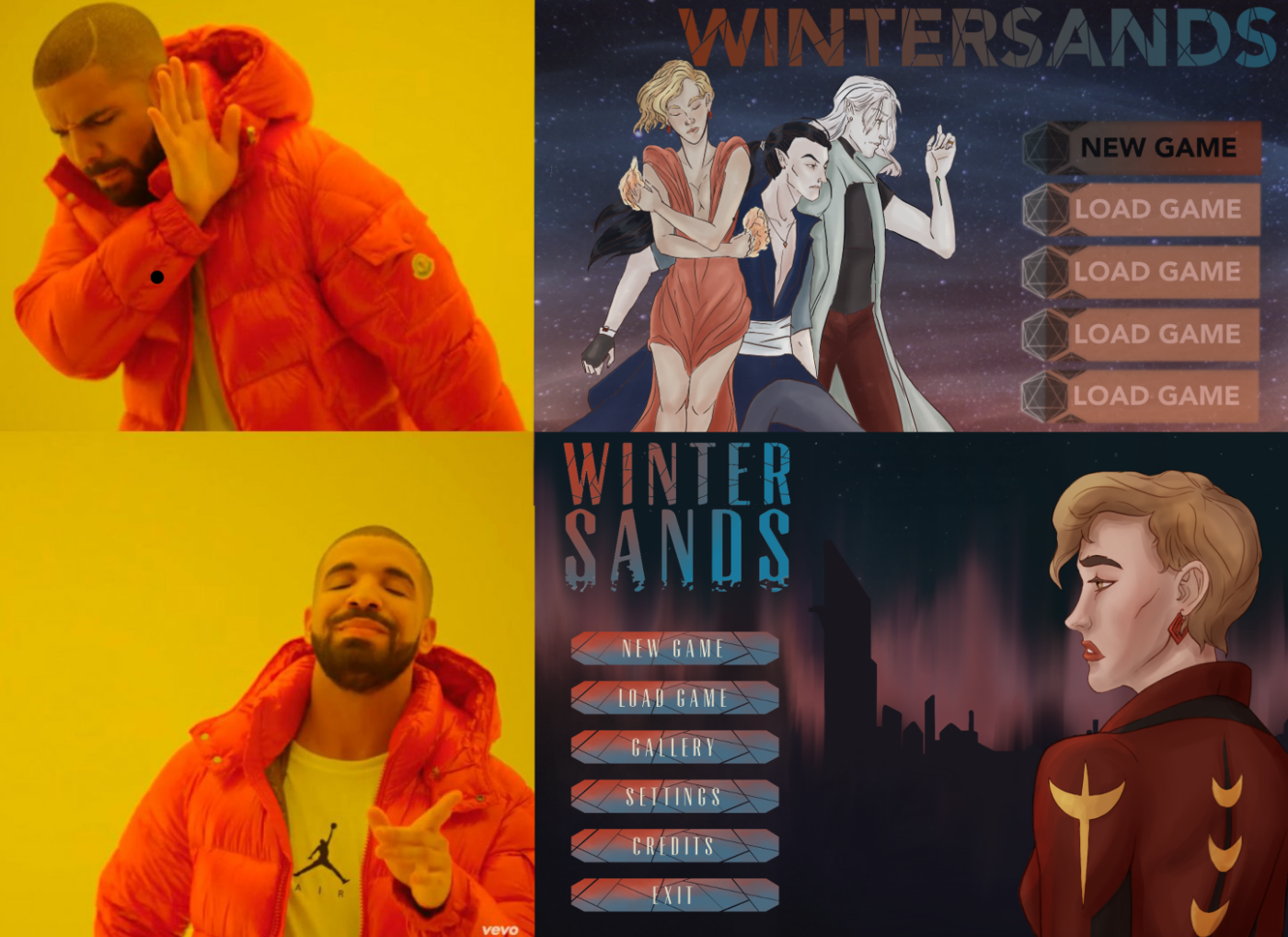
The greatest ordeal was the menu panel – you can see our original inept takes on the first picture in this post. Almost everything has changed since then, and even Agatha’s icon is no longer symmetrical and facing us. Now we’re glad we didn’t go with the first instinct of a non-designer to just approve something and move on, and kept experimenting until we found the look that we were happy with.
THE STORY OF SERENITY IN DESIGN
The good news is, design does get easier. Granted, it’s a talent, but some of it is an acquired taste. We did quite a bit of research on games and comic books to figure out our preferences. Then, concepts started flowing on their own. Thus, the idea to draw the other three menus (Save / Gallery / Settings) with the other three Keepers came with no strain at all. Of course, these menus came with more thinking. Here, for instance, is us brainstorming the Settings menu:
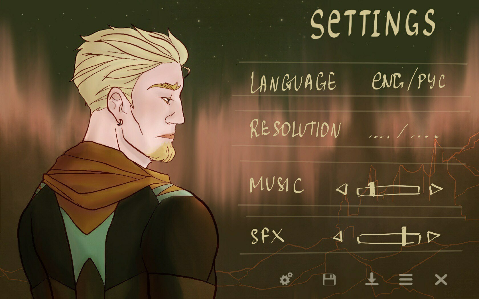
The text option
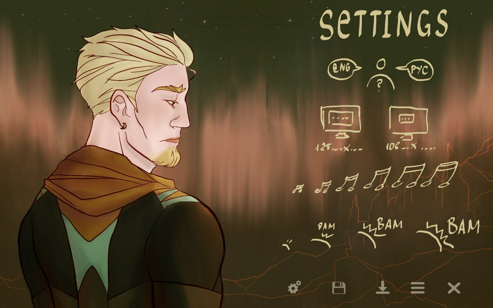
The symbols option
As in a Russian nesting doll, there’s a bunch of smaller design decisions sitting in larger ones. And even though we released the demo, we’re not putting a full stop on design. There’s years of work ahead for both WS Chapters, and things may change as we grow. Even now, we have had to tinker with the size of sprites and buttons for the mobile app – and the result looked so good that we’re thinking of upping the PC version next.
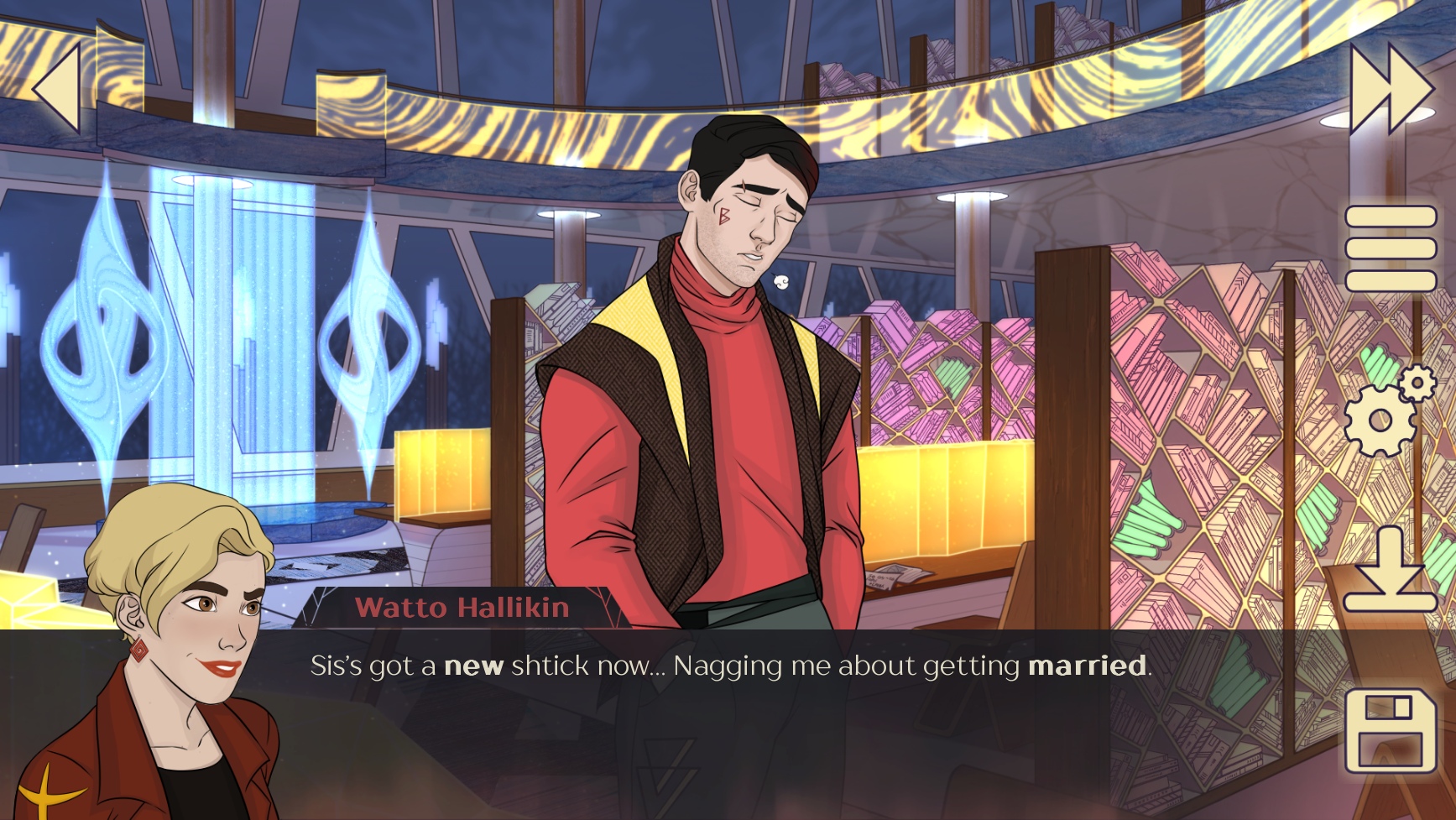
There, much bigger, ahem, better now!
 |
And we’ll have more buttons! In full Chapter One, you’ll see a button in the Gallery for bonus materials for our most thorough players. You’ll know it by the name of S’MORES. |
Besides, there’s always more stuff that needs designing, from the logos of the Daylight and Night Cities to the back of the cards we will once print as merch. It is no longer terrifying to face such challenges, as they make the game only better. And half the answer is usually in the things we’ve already done.
Thus, half the answer to where we got the backgrounds for the game, is hidden in this post. Intrigued? See you next week for the reveal!
Get WINTERSANDS
WINTERSANDS
Take charge of your life and save the magic world from ruin as the Keeper of Fire
| Status | In development |
| Author | trickster-kaja |
| Genre | Visual Novel, Adventure |
| Tags | Coming Of Age, Fantasy, Female Protagonist, Meaningful Choices, Multiple Endings, Romance |
| Languages | English, Russian |
More posts
- WINTERSANDS (extended demo)Jul 31, 2021
- #wsinktober 2020: Sandris PackApr 02, 2021
- #wsinktober 2020: Eliris PackMar 19, 2021
- #wsinktober 2020: Nimeire PackMar 12, 2021
- #wsinktober 2020: Never Too Late for Art or Spoilers!Mar 05, 2021
- WINTERSANDS CHRISTMAS UPDATE - AND A MERRY!Dec 25, 2020
- BONUS! THE ELEMENT OF LOVEAug 14, 2020
- WINTERSANDS: SPRITESJul 31, 2020
- WINTERSANDS: CHARACTERSJul 17, 2020
- WINTERSANDS: BACKGROUNDSJul 03, 2020
Leave a comment
Log in with itch.io to leave a comment.